Fiona O’Keefe is a second year weave student at Central Saint Martins, University of The Arts London. This is the account of her first visit to Premiere Vision.
 Sporting the all-important lanyard and armed with a free guide, Première Vision was at first, and at the very least, overwhelming. Attending the trade fair as part of a class trip, we had been given various tips and tricks to aid our maiden voyage, but negotiating the maze of elevated, opaque stands was something that can only be experienced first hand.
Thanks to an immediate coffee-break and an avid perusal of the surprisingly helpful maps, the day at Première Vision looked somewhat more surmountable. The exhibition halls were vast, but the forums that were scattered throughout each were accessible and offered students a hands-on opportunity to get a feel for what was at the fair.
The biggest forum, situated in Hall 6 Fabrics, boasted a miscellany of mainly-woven samples that were assorted into different trends. Placed side by side, ’Bathrobe’ and ‘Spongey Languor’ attracted much attention as hands reached in from all angles to clutch at the cushiony samples.
Italian mill Mantero Seta had a take on this trend which stood out from their cotton, lilac and chartreuse counterparts. The silk alternative they offered in a blush pink with playful flashes of primary colour created a squashy but sophisticated newness. The feeling here was simultaneously soft and lively.
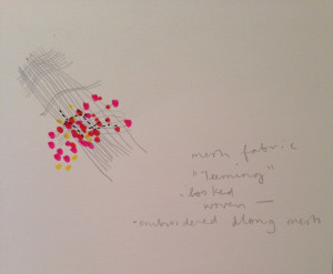
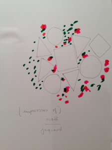
  It was the vivacity in colour, mood and texture that recurred within another trend titled ‘Teeming’, which visibly proved popular among those who came across it. Clusters of colour dotted in and around graphic shapes cropped up on samples from both Ratti and Malhia Kent who used jacquard weaving to produce busy, illustrative patterns.
This energy extended as far as their stands and at Malhia Kent getting past their front desk was akin to gaining entry at an exclusive night club or fashion show. Large, scribbly and dazzling samples in shades of neon green and glittering gold had been tossed artfully over the walls of the stand, and the constant groups of hopefuls milling around it generated a definite buzz.
Nearby at the similarly exclusive Liberty of London, (where fresh slices of sponge cake were offered to buyers with appointments), a t.v. monitor displayed their Spring/Summer 16 trends.
  Common in all three trends was a painterly mark, naive in quality and larger in scale than would usually be expected. ‘Artist Bloom’ was emblematic of this, beautifully blobby in colour and texture while showing minimal use of line.
That hand-rendered element was seen again in Première Vision Designs in Hall 5. The market-like set up of the stands in this area made it far easier to have a look at what was happening.
Antoinette et Freddy presented big, bright paper work with brilliant use of colour and scale. This for me came as a welcome contrast to many of the more repetitious surrounding stands.
Sarah Corynen however, displayed in her samples a fresh, bold use of black line on ecru paper. The inky, hand-drawn approach which characterised Corynen’s designs was simple yet full of personality, and her decisive but varied range of A2 paper-works garnered endless attention from excited-looking buyers. This tone of simplicity underlying Corynen’s designs was echoed elsewhere in Kurkku Alternative’s line of neutral, organic cottons and Emblem Weavers (Export) Ltd straightforward linens.
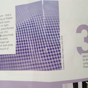
 To offset this, a selection of clever checked shirtings titled ‘Invisible Details’ showed samples from Cotonificio Albini and Soktas. Here, the addition of evenly spaced disruptions through out the conventional check created a discreet optical illusion, and suggested a new wave of understated wit in everyday menswear. In keeping with this scaled-down attention to detail, a selection of ‘Visibly Structured’ monochromatic jerseys on display in the Outer and Over area were memorable for their graphic achievement.
Piecing together all of these similarities and contrasts from Premi̬re Vision, allowing them to both intermingle and stand alone, creates an image of what is to come in terms of colour, scale, texture and theme. However this is of course my individual interpretation of what I was drawn to and inspired by at the fair, and what eventually does becomes a trend will surely be decided by the masses. Saying that, if there is one thing to take away from Premi̬re Vision it is that despite its ample vastness, what it boils down to is the individual, the design, the idea Рand that is what inspires.

Leave a Reply