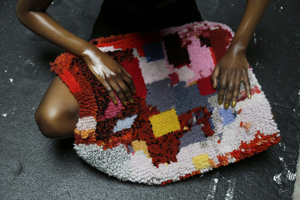
 Josephine Ortega
My project investigated the perception of ‘comfort’ and culminated in concept proposals for transport seating. In order to define this abstract notion, I explored where and when people feel at their most comfortable through a questionnaire. The documentation of these answers through photography allowed for the visualisation of comfort to become more transparent, which ultimately meant that the concept of ‘comfort’ could become tangible and definite, making it easier to depict. The main visual inspiration taken from an individual’s home and swimming pool were translated into the designs through extracting elements that referenced colour, pattern and yarn choice.
Central Saint Martins, University of The Arts London.
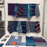
My collection of handwoven fabrics was initially inspired by modern architecture. After drawing and creating collages from photography of buildings around Glasgow and Edinburgh, it became apparent that some of my drawings were very graphic whilst others were more painterly; this led to me exploring the idea of developing fabrics that contrasted graphic and painterly qualities.
I identified weave structures which allowed me to play about with geometric patterns and shapes, and used different blends of colours and yarns to achieve the more painterly aspects identified from my drawings. The final collection is a range of fabrics intended for interiors, woven from silks, soft cottons and lambswool yarns.
Glasgow School of Art
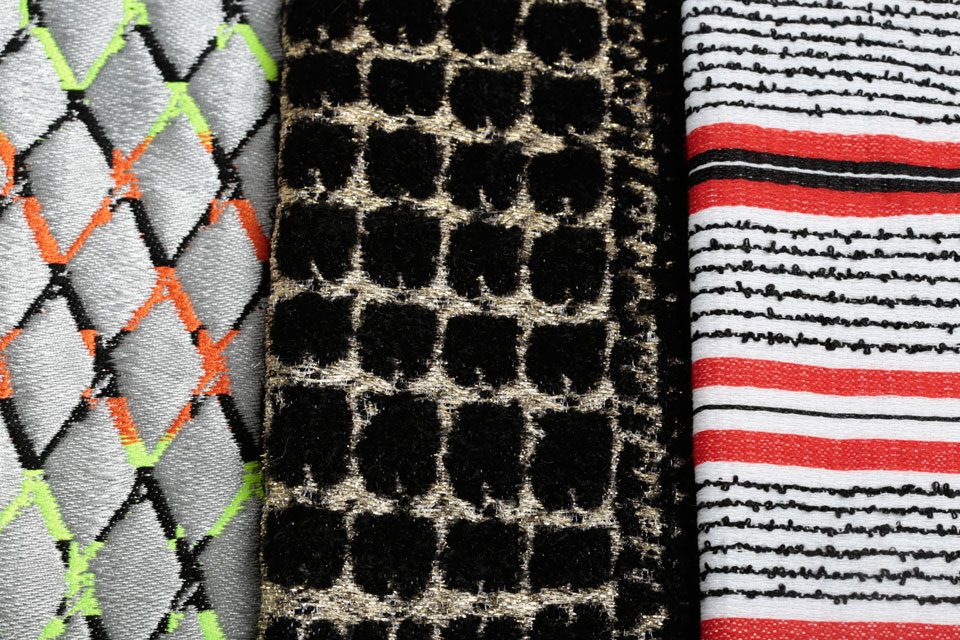
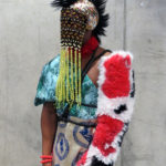
My project focuses on ‘hybridity’, through the fusion of the culture and customs of two major tribes in Nigeria, with British traditions and customs. I combined elements from these two very distinct cultures in order to produce a collection of luxury gender neutral fashion fabrics suitable for both the male and female markets. The collection draws inspiration from the sights and sounds of the metropolitan city of Lagos, Nigeria, juxtaposed with contemporary notions of British Folk. This cultural fusion is materialised through unexpected combinations of colour and texture, ranging from natural raffia to bold neons and metallics. A modern take on a traditional tribal narrative, this graphic collection seeks to uncover the rapidly developing hybrid fashion subcultures in today’s multi-cultural society. Â
Central Saint Martins, University of The Arts London
The theme of my project is ‘Out of season seaside town’. Blackpool is my hometown and I wanted to focus on the sadder side of Blackpool which most people do not consider. Most visitors to Blackpool focus on the tower, the promenade and the piers but they won’t always notice a decaying building or shop shutters. When there are not that many tourists, Blackpool is a lot quieter and lots of the shops are shut. I find the textures on the buildings and shutters really interesting, you can see the decayed layers of paintwork and rust which have not been maintained properly.
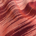
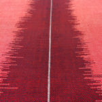
Throughout my project, I am endorsing the neglected and transforming it into a luxury product. By taking it from one extreme to the other. I have used silk and cotton to weave 3D pleats, 2D graphic fabric and textural pieces. I have created double cloth silk pleats to emulate the decayed shutters. I have used different patterns on my double cloth warp to create a gradient effect, however,
I have used 1 yarn to create 4 different shades of the same colour. Some of my pleated final pieces have copper wire in the top, which means that they can be hand manipulated. I want to create optical illusions within my fabric, that make you wonder how it’smade. I have looked at many different artists and designers to inspire my project, for example, Margo Selby, Andreas Moller, Dash and Miller and Ann Richards.
http://www.artsthread.com/profile/elisedavidson/
Glasgow School of Art
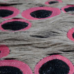
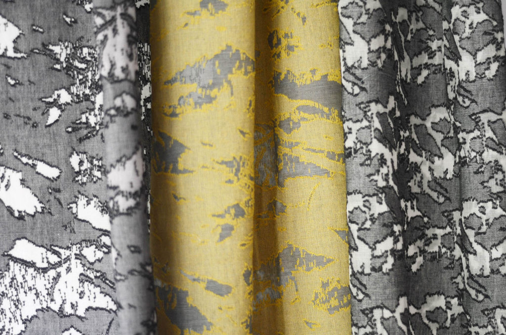
After collecting imagery of degraded buildings in Mumbai and Vienna, often over-painted in vivid colours to draw attention away from their age, I began exploring colours and textures in my drawings based on the theme ‘Degraded Textures’.
The fine artist and designer, Bernat Klein, has influenced my creative process by observing how he translated textures from his paintings into choices of yarn, colour and patterned woven fabrics. Analysis of collections by companies such as Kvadrat, Bute Fabrics and Création Baumann fuelled my interest in designing a range of current, co-ordinated fabrics that could tastefully combine vivid colours and surface texture contrasts.
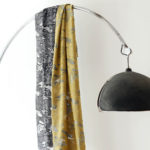
Throughout my project, I have aimed to translate the theme of painted textures into commercially viable, luxurious textural designs for contemporary interiors. Silk mohair, wool mohair loop and silk bouclé have been particularly effective for translating textures of degrading painted and plastered walls. Working with Scottish mill MYB Textiles, I created sheer madras lace fabrics in large-scale repeat patterns. These have been complemented with jacquard pieces inspired by illustrative, digital interpretations of painted textures.
cargocollective.com/re_northedge
Glasgow School of Art
Throughout my final year studying weave at UCA Farnham I had been researching into modern architecture from London, in particular brightly coloured buildings. I really utilised my sketchbook, using collage to help connect my ideas to my woven designs. I began weaving with wool using the inlay technique, but moved onto using silk to create a more contemporary look. My weaves are all hand woven and hand dyed, which meant that I was in control of my work from the start of the process. As I wanted to continue with the hand crafted aspect in my work I was also hand painting silver lines onto some of my designs representing the steel from the modern buildings.
lsbennett5.wix.com/woven-textiles
UCA Farnham
All text and images in this post Designers own copyright



![Woven wool[1]](https://theweaveshed.org/wp-content/uploads/2016/07/Woven-wool1.jpg)
Leave a Reply